
OverView
In this project I would like to explore and design a better UI
of the Netflix app for the kids. The current interactions design and the whole experience of using the app only satisfy adults’ need but how about kids?
ProductS
Tablet App
ToolS
Photoshop
Illustrator
Sketch
MOTIVATION
Are kids of the younger age able to use the app smoothly?
What constitute as a good design for kids?
These questions motivates me to conduct the research, to understand and to learn how to design a better UI for kids.
THe Process
I follow the HCD process: Discover, Define, Design and Deliver in this project. I first conduct a competitive analysis to get an insight of the market and what might be my target audiences looking for. Then I defined what the problem is on the original app and jumped right into the ideation phrase. From sketches to wireframes, and then high fidelity prototypes.

Research
Designing UI for kids
The first thing on my list is to learn about the rules of designing interactions for kids, and here are the major 5 key points of it:

Interaction feedback is essential
Kids need to know if their action leads to a result successfully, otherwise, kids will mistakenly think that the app is crashed or simply the tablet has broken down.Swipe, tap and drag (http://techandplay.org/tap-media-pack.pdf)
65% age 0-5 able to swipe without assistance, 60% execute functions like drag items across the screen, open their apps, tap to operate commands. Around 50% can exit and enter apps, increase or decrease volume. Also it’s interesting to see only 45% understand clicking on a cross will dismiss a pop-up.
Touch target
Avoid putting any buttons around the edge because kids that 3-5 years old have less motor skills and often touched the edge by accident.
Children’s physical development
It is better to design apps for different kids groups by focusing on a two-year range max, as children develop fast physically.Consistency
According to Debra Gelman: “Elements that get in the way or animate spontaneously or don’t contribute to the overall goal can frustrate kids and adults alike, and cause them to abandon a game or an app.” Being consistent in UI design will minimize frustrations for children.
Competitive
Reviews
I conducted a heuristic evaluation on the Netflix app and it’s competitors. Along with the SWOT analysis to help assess Netflix's opportunity and challenges in the market.
Heuristic Evaluation
Key Takeaways
After analyzing the information and results from the heuristic evaluation and the swot analysis, I’ve got a better understanding of the whole market, and how Netflix the app is doing compared with its competitors. And here I’ve narrowed down to 3 opportunities and 3 challenges of the Netflix app that :
OPPORTUNITIES
Great global contents & localization alliance
As a leader in VOD services of 167+ million subscribers in 190+ countries that carry both copyrighted and original contents. Apart from providing different languages options and subtitles in American-based shows, Netflix also branching out into foreign shows.
Parents willingness
35% of parents use tech gadgets to entertain their kids and 23% of parents want their children to be tech-savvy.
No-Ads with affordable pricing
According to Business Insider, Kids who only watch Netflix can avoid 230 hours of ad a year. Starting from 8.99 without ads is definitely a great combo for the parents. So they wouldn't worry if their kids would be exposed to unpredictable offensive and adult contents.
CHALLENGES
Strong competitors & unpredictable government policies
Subscribers are not aware Netflix is losing Disney content in 2019 and 38% pays Netflix for it’s kids content. Strong competitors such as Youtube, Amazon Prime Video, Twitch etc. and the Federal Communications Commission (FCC) is something that Netflix needs to keep an eye on.
Limited parents control
The only thing parents control is the film/tv content rating. No other tools such as timer or passwords are found.
UI & Interactions not for kids
The UI and the interactions design is clean and practical for adult viewers but definitely not designed for kids.
Persona
After conducting the research, I created two personas - Melissa the mum and Gina the daughter, as the target audiences that I want to focus my design towards.
User Journey
Then I proceed to create their own journeys to sort out what are they feeling, experiencing and their pain points while using the app.
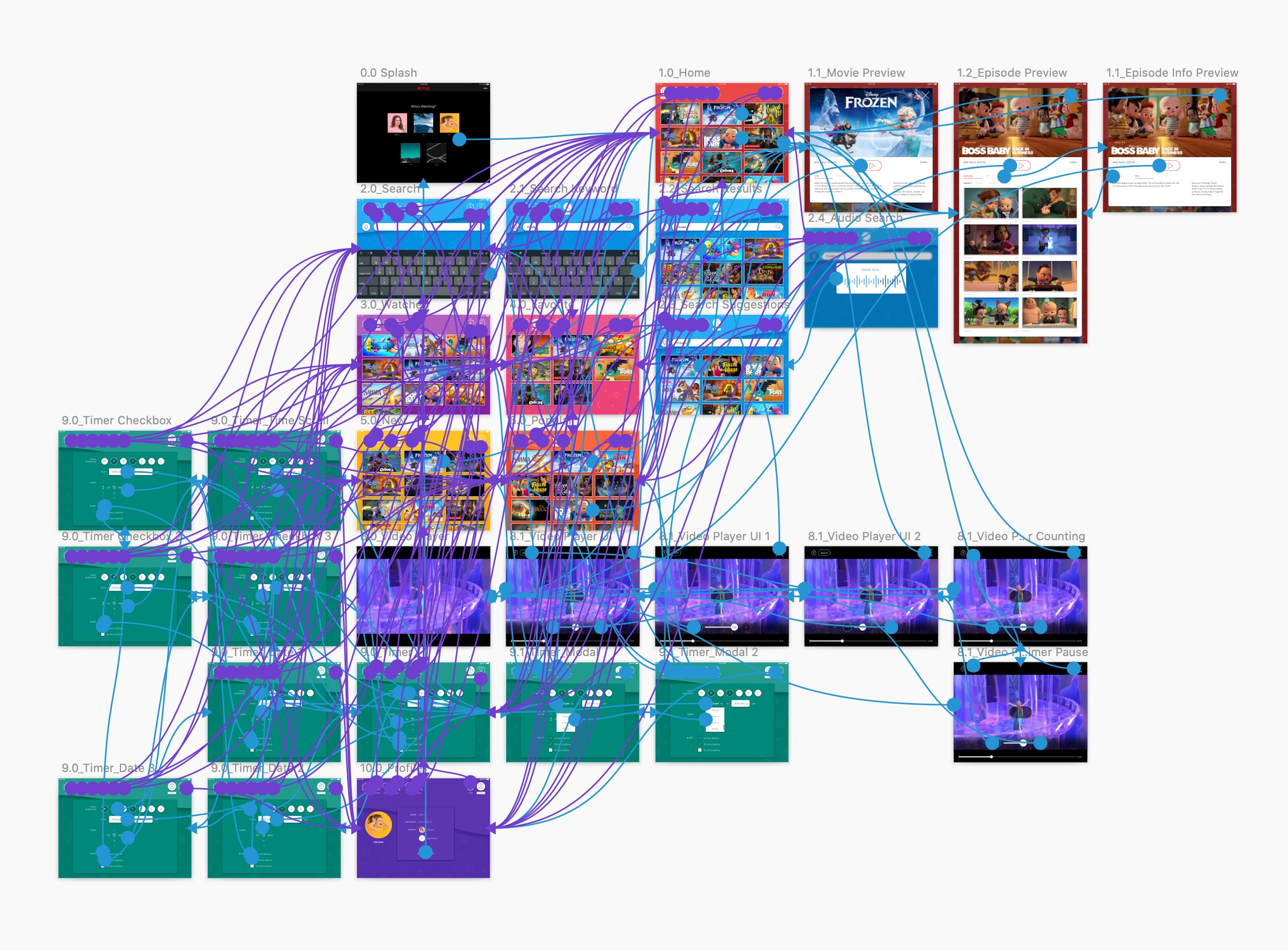
User Flow
Here’s is the current user flow of Melissa and Gina. The reason why it is a combined user flow is because Gina doesn’t know how to navigate the Netflix app. Pink color represents Melissa and Yellow represents Gina.
Goals
How to make the app easier to use and more attractive for kids?
After synthesizing the insights from my personas and research, I decided focus on redesigning for kid ages from 3-5 and to explore the following 3 areas:
1) Larger & more kids-friendly UI:
Larger navigation menu
Bigger and replacing icons from words
Larger Video player UI
2) Parental Control:
More options and easier to control the app
Team work with children while setting up screen limits
3) Interaction cue & Instructions:
Sound effects while scrolling and tapping
Graphic animation when holding and tapping
Animated loading screens
Below is the user flow that I predict how Gina could operate the Netflix app by herself and select her favorite show to watch by the end of the redesign.
Design
Sketches + Sitemaps
I started off by sketching out quick wireframes and the sitemap.

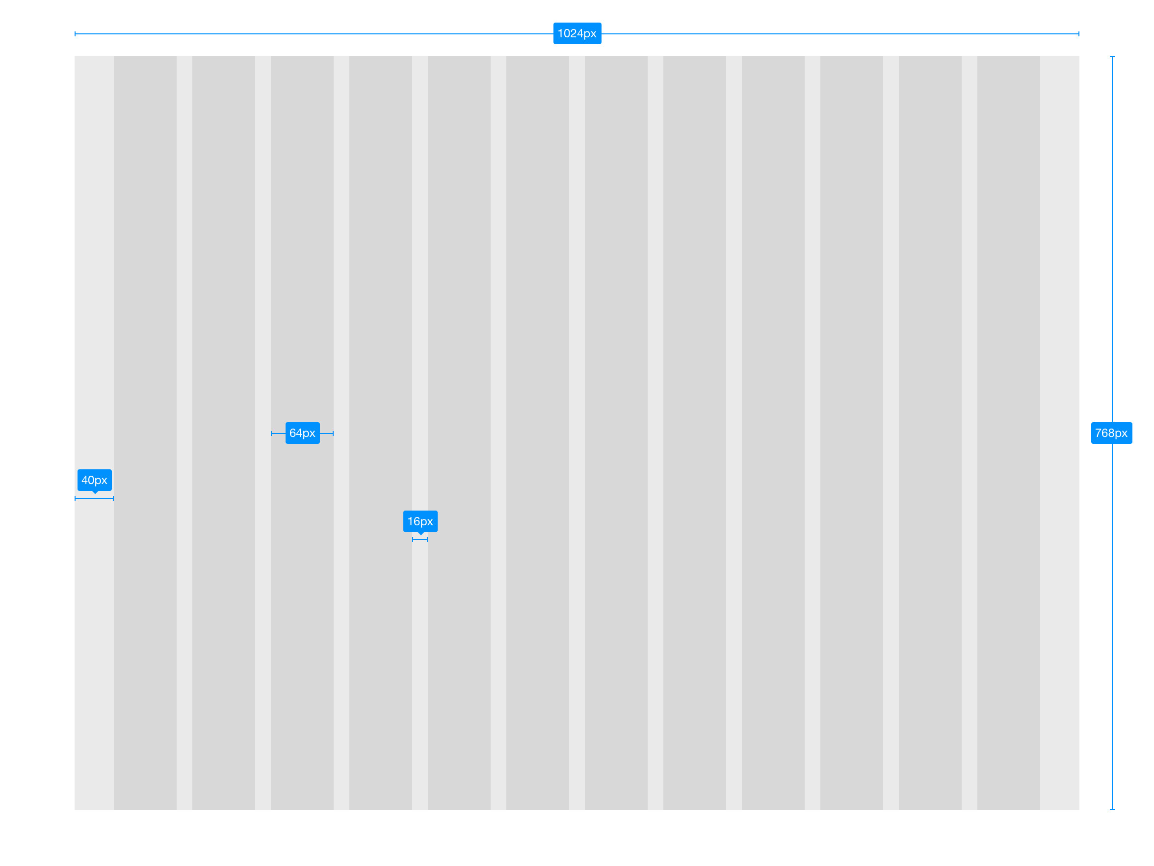
Grid System
The screen size I am using for this project is the iPad Mini 2 (2048x1536px at @2x). For the grid system, I decided to use the 8pt grid system to create UI elements for this project.
Wireframes
In this round I’ve created all the low-fi wireframes based on the sketches and the sitemap I drew earlier on, to learn further on the connection of each screens and the structure of the app. I made three iterations One decision to make was to decide which home screen design is more suitable for my persona.

I decided to go with #2 because it is the most simple and clear layout among the three. The #1 design is a bit complicated as the left and right arrows add more burden on the interactions. The #3 design is a card layout with one video showing for each category, it’s simple and direct on the home screen but it takes away the freedom to explore in the app.
After that, I polished my low-fi wireframes further into mid-fi wireframes, closer to pixel-perfect as how’s the sizing of the UI elements would look at the end.
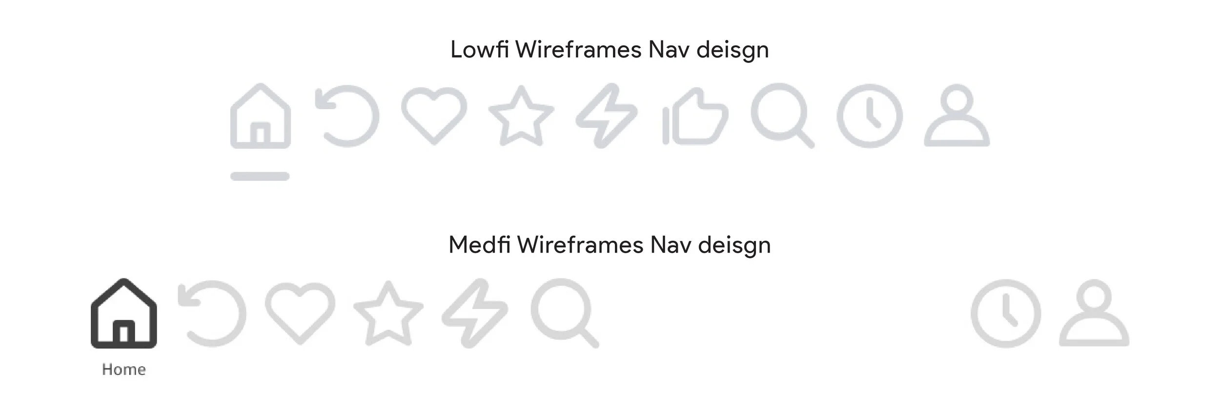
I removed the “Recommend” tab during med-fi because I think it is quite unnecessary since the home screen does the recommend action. Also, I decided to separate out the Timer and the Profile tab as they belongs to the “settings” functionality. So the users can receive a clearer visual cue on which portion controls the selection of the video and which controls the settings.
I have also created a quick and simple low-fi prototype mainly to validate whether the whole interaction is simple enough and to evaluate whether the sizing is big enough for my target audience.
Low-fi Prototype
Moodboard
For the design style I created this mood board to show how I wish the redesigned app to look like. Colorful and bright colors would attract my persona’s attention, therefore, I assigned a main color to each page.

Font
Quicksand was my best choice as it has more rounded edges and also legible at the same time. It gives kids a friendlier feeling and also stylish to look at. Another reason that makes me picked Quicksand is that it has a lowercase "big bowl “α” instead of the old-style “a”. It mimics how the kid would write in the reality and it’s easier to read.

Color & Pattern
I picked 8 bright and fun colors from the material design color system. With the icon that represents each app page, I incorporated them into individual pattern design as each app page background.
Hi-fi Prototype
Thoughts
Design is not on a straight line.
I strongly felt about this statement while I am working on this project. There are much more back and forth than I have anticipated.